Apronworks
„My old logo was AI-generated. I wanted something of my own that looks more professional.“
Apronworks builds customised accessories for private aircraft: wheel stops, iPad mounts and other parts you simply can't get off the shelf. Previously the brand ran with an AI-generated logo that vaguely looked like aviation but felt interchangeable and didn't match the craftsmanship behind the work.
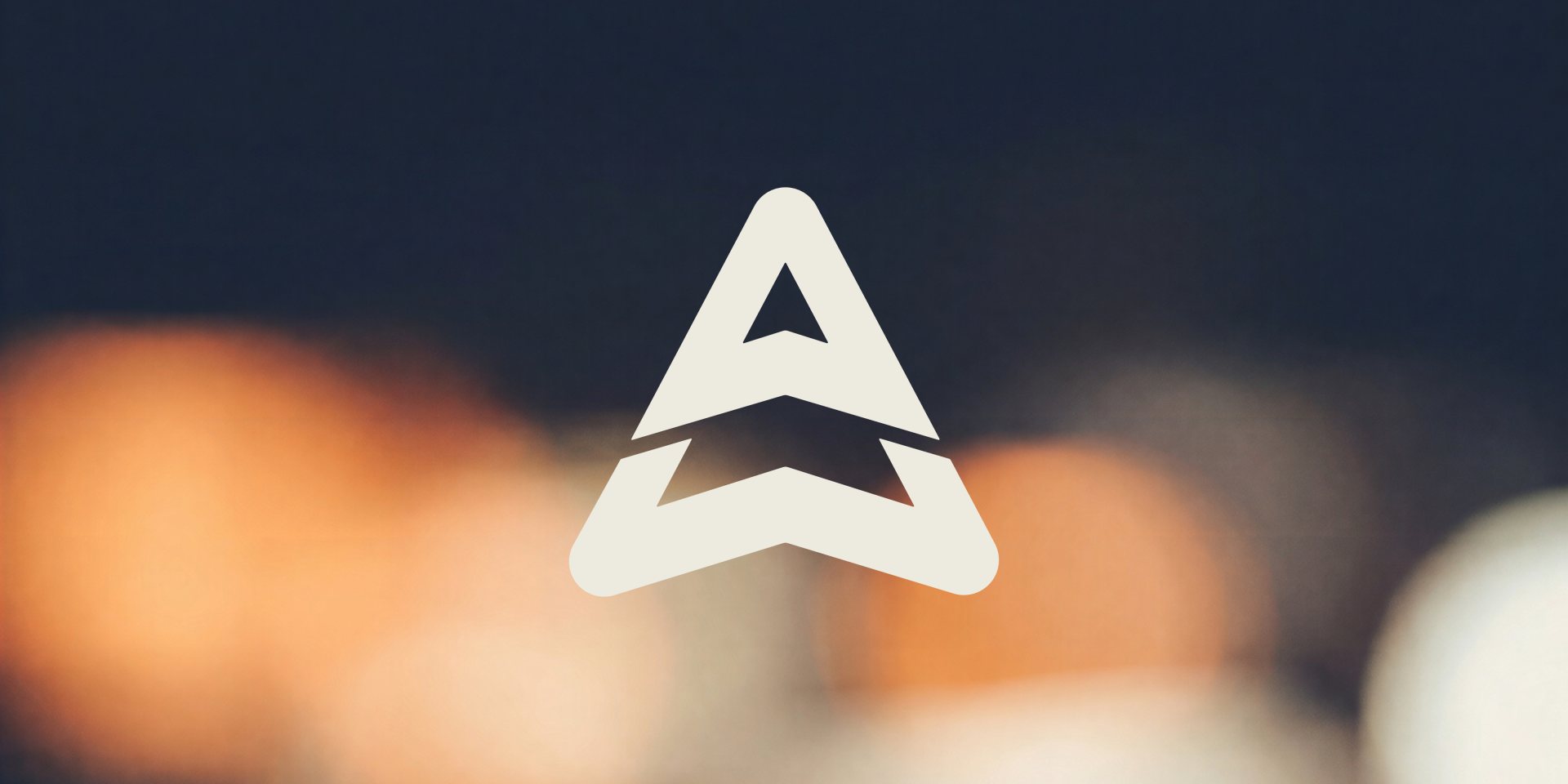
The result is a distinctive wordmark-plus-symbol brand: an arrow shape that echoes a wing and tail, combined with a clear, technical wordmark and the addition of "Aviation Parts". The colour world draws on workshop and cockpit rather than generic tech-blue: Charcoal Blue and Jet Black meet Sandy Brown and Reddish Brown, with a warm cream as contrast.
Delivered across all the touchpoints Apronworks uses day to day: logo in multiple colour variants, business cards and merch, consistently designed for instant recognition.