Safehouse
„We only had the logo, which we had built ourselves. It worked, but it lacked recognition value.“
Safehouse is an IT and management consultancy based in Essen. The team optimises costs and increases security for companies across four areas: IT security, energy contracts, energy management with photovoltaic and storage systems, and operational safety against fire and break-ins. The process is always the same: inventory, analysis, written recommendations with concrete figures, and implementation on request.
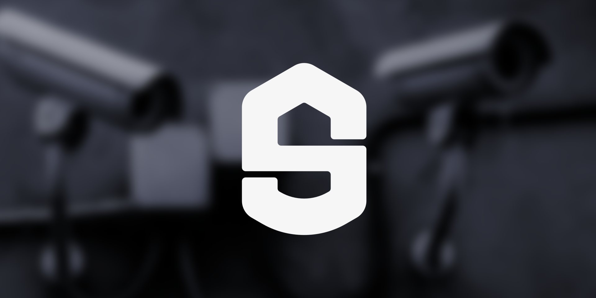
There was already a self-built logo, assembled from standard shapes and without genuine recognition value. Rather than reworking it, the brand was developed from scratch at its core. The starting point was the question of which visual language conveys a sense of security: strong enough to communicate stability, yet calm and geometric rather than loud. From a collection of associations around house, lock, shield and protection, the basic form emerged.
In terms of colour, a deep navy was set as the base, combined with a bold orange as an accent. The navy carries the seriousness that consultancy requires; the orange breaks the coolness and makes the brand approachable.